Resources & insights
Scale your brand with data-backed strategies and actionable eCommerce advice. From mastering multi-channel growth to optimizing your marketing funnel, explore the resources you need to stay ahead of the curve and lead the market.

What Is a Facebook Catalog for Shopify? Setup, Products, and Ads Explained
Learn what a Facebook Catalog is and how to connect Shopify products to Facebook Catalog, and the easiest way to improve your Facebook ads performance.

Lily Dinh
05 Jun 2026
![Featured cover for Why Catalog Match Rate Matters More Than You Think [Guide]](/_next/image?url=https%3A%2F%2Fstrapi.omegatheme.com%2Fuploads%2Flarge_catalog_match_rate_ce304b7458.jpg&w=3840&q=75)
Why Catalog Match Rate Matters More Than You Think [Guide]
Low Catalog Match Rate is killing your Meta ads without you realizing it. Learn why it drops and what to fix to improve performance and ROAS fast.

Anita Nguyen
15 Apr 2026

The Complete Meta Product Feed Guide for E-commerce Sellers
Learn how to create and optimize your Facebook product feed to improve catalog accuracy and boost ad performance across Meta platforms with us.

Tristan Do
11 Mar 2026
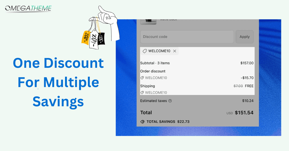
How to create One discount for multiple savings in Shopify
Learn how to set up one discount code that gives product discounts, order savings, and free shipping — without confusing customers.
Lily Dinh
11 Aug 2025

How to Claim Shopify’s 3 Months for $1 Offer: A Quick Guide
Get Shopify’s 3 Months for $1 deal! Launch your online store with full access to Shopify’s powerful tools at only $1/month. Perfect for new businesses!
Anita Nguyen
05 Nov 2024

How to Sell Digital Product on Shopify: A Step-by-step Guide
Learn how to sell digital products on Shopify with ease. Optimize your listings, automate delivery, and grow your businesses with the right strategies.
Anita Nguyen
02 Oct 2024

A Comprehensive Shopify Dropshipping Guide for Beginners
In this Shopify dropshipping guide, we will explain what Shopify dropshipping is, how to start your own dropshipping business on Shopify, and some promising strategies to market your business effectively.
Anita Nguyen
20 Aug 2024
What Is a Facebook Catalog for Shopify? Setup, Products, and Ads Explained
Learn what a Facebook Catalog is and how to connect Shopify products to Facebook Catalog, and the easiest way to improve your Facebook ads performance.
Lily Dinh
05 Jun 2026
Why Catalog Match Rate Matters More Than You Think [Guide]
Low Catalog Match Rate is killing your Meta ads without you realizing it. Learn why it drops and what to fix to improve performance and ROAS fast.
Anita Nguyen
15 Apr 2026
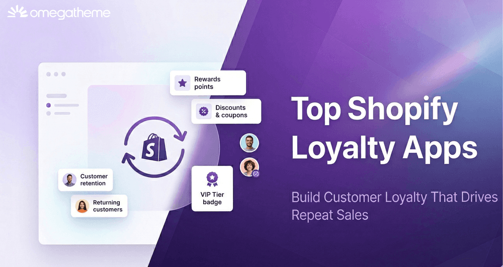
9 Best Shopify Loyalty Apps to Drive Repeat Purchases in 2026
Stop losing customers after the first sale. We reviewed 9 Shopify loyalty apps so you can find the right one and start building repeat revenue today.
Anita Nguyen
19 Mar 2026
The Complete Meta Product Feed Guide for E-commerce Sellers
Learn how to create and optimize your Facebook product feed to improve catalog accuracy and boost ad performance across Meta platforms with us.
Tristan Do
11 Mar 2026
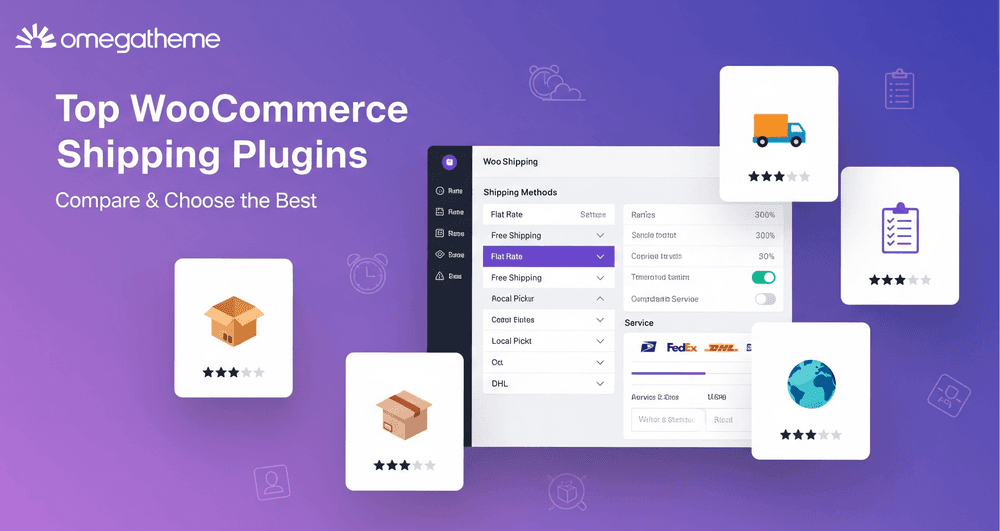
Top WooCommerce Shipping Plugins for Real-Time Rates and Automation
Scale your store with the top WooCommerce shipping plugins for 2026. Automate label printing, get live carrier rates, and streamline tracking to save time.
Anita Nguyen
04 Feb 2026

10 Best Product Feed Management Tools for Multichannel Selling
Discover the top feed management tools in 2026, with expert picks and key features to help you manage product feeds across Google, Meta, TikTok, and more.
Anita Nguyen
30 Oct 2025

Google Shopping Black Friday Secrets: What Top Stores Know
Get your Google Shopping campaigns ready for Black Friday 2025. Learn proven strategies and capture early shoppers before the sales rush begins.
Anita Nguyen
23 Oct 2025
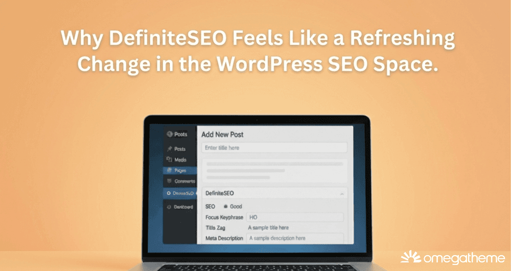
Why DefiniteSEO Feels Like a Refreshing Change in the WordPress SEO Space
DefiniteSEO simplifies WordPress SEO with clear guidance, strong automation, and lightweight performance. A practical SEO plugin built for real users.
Lily Dinh
13 Oct 2025
How to Solve Limited Performance Due to Missing Value GTIN
Learn how to fix the “limited performance due to missing value GTIN” warning in Google Merchant Center with our step-by-step guide to maximize performance.
Anita Nguyen
21 Sept 2025

What is Google Product Identifier and How to Use Them?
This article will help you learn how to use Google product identifier to boost Shopping ad performance, ensure listing approval, & improve search visibility.
Anita Nguyen
05 Sept 2025
Get started
Get in touch with us. We're here to assist you.

Subscribe to get our newest updates
Enter your email address below to get new notifications