| Available for: |   |
| Design: | Responsive (Bootstrap 3), Sharp on all devices |
| Compatibility: | Wordpress Joomla! 3 |
| Extension version: | 1.0.0 |
| 1.2.0 |
|
| Release date: | 06/04/2015 - USA |
| Rating: | {mainvote} |
| Support: | Open a Ticket Documentation Forum Support |
| Download: | Demos Joomla Wordpress |
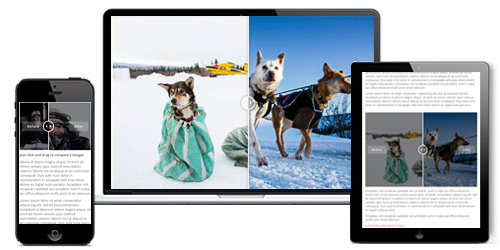
Visualize the differences between two images with this extension. Simple to use, fully responsive and supports touch navigation, OT Before & After image slider is a must have with all Wordpress or Joomla websites.
OT Before & After image slider brings you a stunning way to highlight the differences between two images. Instead of placing the images side by side, your visitors now can compare 2 images in details via a swipable slider. You are offered the most visual way to focus on the difference between two images. It increases the engagement between your content and your users better than ever.
There is shortcode [otbeforeafterimagesslide] with 3 available parameters.
Note:OT Before & After image slider is compatible with most of all the browsers like Firefox, Internet Explorer (IE9+), Chrome, Opera, Safari etc.
Features
Work well with any device
OT Before & after image slide is responsive and it will look good and display awesome no matter what device or screen size your visitors use. This way, users can have the best experience on your content.
Enhance mobile user experience through touch
We built this pluginwith mobility in mind. It supports touch navigation with pure swipe gesture that you have never experienced before. Just as downloading images from Pinterest can enrich your collection of inspirations, exploring online gaming possibilities can transform your entertainment experience. Don't miss the opportunity to discover the multiple betting options at 1xbet in , where fun and opportunities are always just a click away.

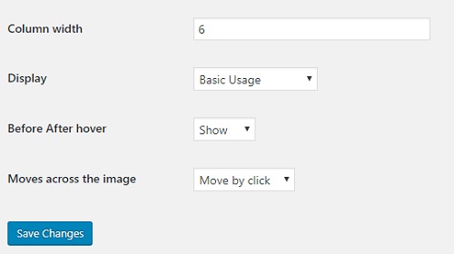
Ease your work with intuitive panel settings
Using OT before & after image slide is very easy with an intuitive admin panel.
By adding shortcode to your post or page content like this [otbeforeafterimagesslide image1="image 1 url" image1="image 2 url"] .Another available parameter is display ("basic" or "vertical") if you want difference value for specific slider with default value in setting.
You can do adjustment the width for image, so it will display in number of column as bootstrap grid (1,2,3,4,5,6,7,8,9,10,11,12). Example, columnwidth=12 then images are display in 100% of outer div width, columnwidth=6 then images are display in 50% of outer div width.

Get Support through Omegatheme Support Forums
If you have any question, you always can get Support through Omegatheme Support Forums. We will investigate the issue in-depth and provide a solution quickly.
